Psychology of Colors in Marketing
The color-persuasion dialogue is very interesting although also very misunderstood in the marketing world. Color theory is a somewhat complex subject, but its usage in marketing and brand designing is rather overly simplified with just flashy infographics.
These shallow talks aren’t deep enough to assist someone to come up with well-informed decisions on how best to use color and pass the right message. Merchandisers, for instance, use various colors to elicit certain feelings that will get customers to shop.
Similarly, the choice of colors in personal branding highly affects the impression you’ll have up on people.
To understand color process in content marketing requires going back to the basics – what does color psychology really entail, how can colors shape moods, behaviors, and reactions, and most importantly, how will these understandings spill over into better marketing practices?
This guide will help you get all the answers and understand the psychology of colors for various purposes like marketing and branding:
What is Color Psychology?
Color psychology relates to the impact of colors on human behavior and mood. Every color conveys something or a particular meaning, thus influencing certain aspects of human mood and decision-making abilities.
Color psychology must be recognized because it differs from one individual or culture to another. In the marketing world, perception is best determined by color, as it is an indicator and proof to customers as to how brands and products are perceived.
How you want your business to be perceived before your target audience does depends on the right color palette chosen. Researchers revealed that up to 90% judgments of products on snap decisions according to color alone.
Importance of Color Psychology in Marketing
Color – whether consciously acknowledged or not – plays an enormous role in marketing. The colors that you use to brand yourself, ranging from your logo and marketing collateral, touch the consumers’ emotions.
Color psychology has an enormous effect on how consumers behave, decide, and perceive brands:
- First impressions: up to 90% of the first impressions created can be based on color.
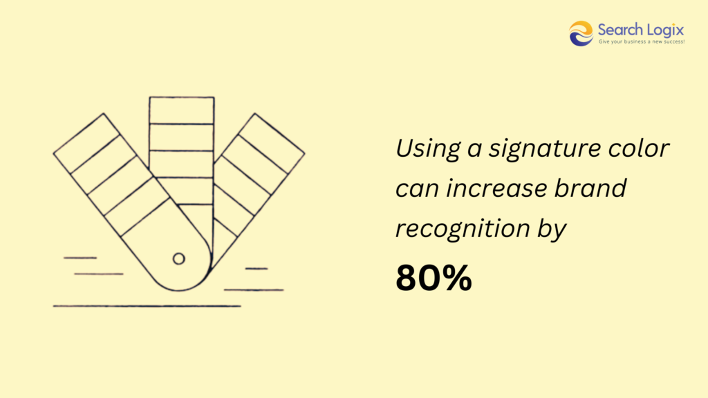
- Brand awareness: Color can increase brand awareness and recognition by 80%.
- Purchase decisions: 93 percent of customers decide on purchase decisions only based on their vision.
Now, here are some core reasons to utilize color psychology for marketing and branding:
- Brand Identification
Colors will be naturally associated with the brands. For example, whenever you hear Home Depot, orange is what comes to mind. When you choose colors that easily come to the association of your brand, you make it easier for the consumer to remember and recall your brand.
- Connect with Diverse Moods
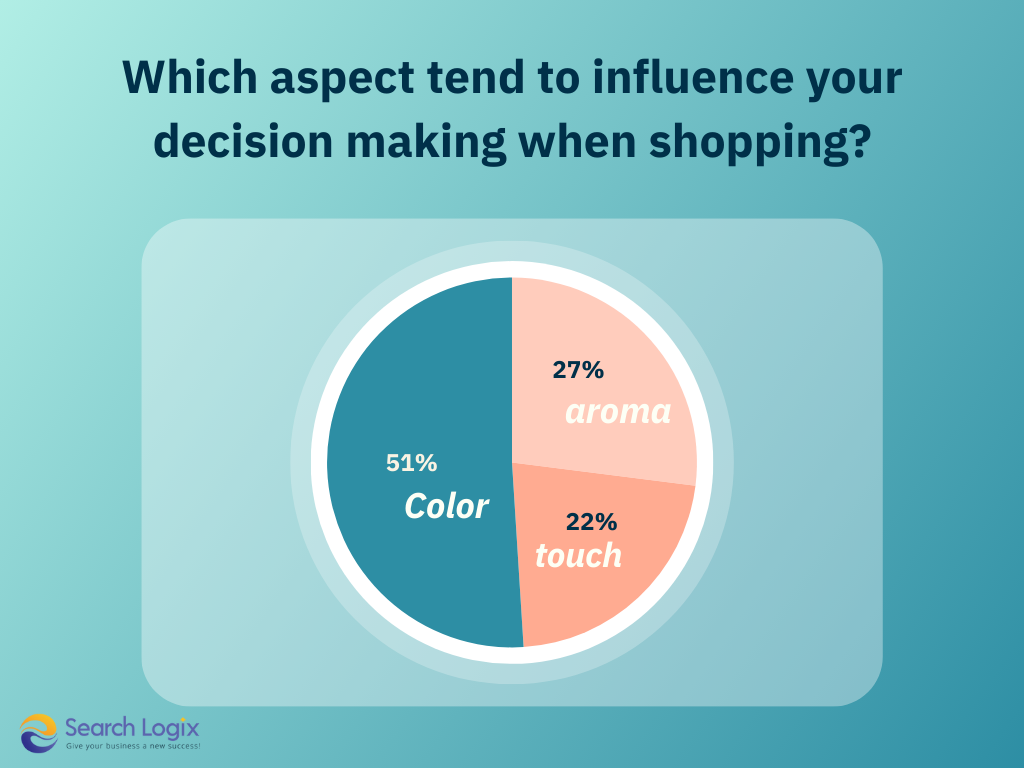
Colors can evoke certain emotions and have the impact of what the consumer feels about your brand. Bright yellow can provoke feelings that are cheerful and optimistic, and then red can cause one to be stricken by excitement and passion. The colors you pick will define the personality of your brand and send the right message to your target market.
- Creates Perception
Colors will determine how consumers perceive your brand. Vibrant, bold, and creative colors may communicate excitement and innovation, whereas the more subdued color will portray refinement or good trustworthiness. Color also works to influence judgments about quality, reliability, and value for consumers making selections about your brand.
- Consistent Branding
Therefore, creating the same color concept for all your marketing materials to achieve a uniform brand experience will help to establish brand identity and leave more lasting impressions among consumers.
It is through consistency that one can have good brand recognition; when consumers se1`e their repeated brand colors, they better know the brand and tend to retain the memories about it.
- Decision Making
The colors you choose can really persuade the consumer to want to engage in your brand or to buy. With the selection of proper colors, you can really drive marketing decisions – from the smallest packaging design to web design – so everything stays within the brand’s consistent experience.
Colors that Impact Psychology in Marketing
As the brands choose their color palette to set a theme for their business, they also ensure to reflect the message behind it. Let’s understand the meanings and psychology of colors in marketing of different brands.
1. Black
Black is practically everywhere in branding, from websites to emails and even within logos. It can imply sophistication, power, or class. In fact, numerous premium brands such as Chanel prefer it for designing glossy and sophisticated logos. It reflects the use of black in the names of high-tech industry logos because some 3 in 10 companies feature it.

On the other hand, black has also negative meaning such as oppression, cold, or even evil; perhaps it is also very popular in the fashion industry though does vary across different sectors.
Its usage in the health industry for example is not common because black reminds people of the dead and the mourned. Nike is a great example on how black can be implemented in the branding. The swoosh symbol itself combined with the black and white advertisement reifies this by means of power-based branding.
All the communication is about empowering the athlete and assisting the customer in becoming a stronger performer, and that tone itself resonates well with the elegance and power conveyed by black.
2. Red
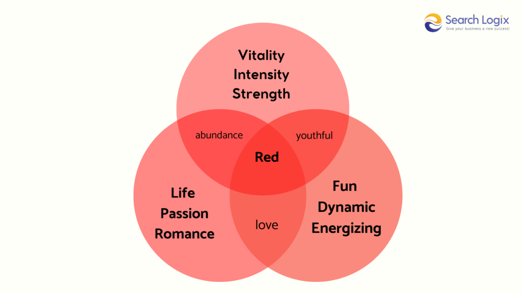
Red color naturally plays out the meaning of warning and preparation together. It accelerates breathing, boosts heart rates, and promotes hunger, thus explaining why it is highly in demand among quick bite establishments.
Whereas most organizations use red as a color complement, some brand organizations place much emphasis on using red as part of their brand identity. Such companies that have really made a success out of the use of red include; Coca-Cola, YouTube, and Target.
Color blindness when designing marketing visual is something to be considered. Most individuals with this disability cannot see the color red, and messages concerning danger or warning are likely not to appeal. To make such cues obvious, using contextual clues of wording or shapes can help carry on the message.
3. Blue
Blue is a color that men will instantly love. 57% of men will rank blue as the first-color favorite, followed by women at 35%. Brands have realized its attraction; hence its popularity becomes the top favorite logo color of 33% of the best brands.
As blue creates the feelings of security, power, wisdom, and trust, it is used by social media companies like Facebook and Twitter for such dependable qualities where a lot of user data passes through these businesses.
However, with its scarcity in nature suppressing appetites, blue can further give a sense of coldness or unfriendliness.
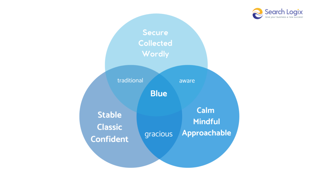
Finance and tech brands, for instance, rely on the color blue in order to project their sense of trustworthiness and professionalism, such as Visa and IBM. Darker shades of the color, however, sometimes convey a cold, unapproachable feel.
To balance that out, brand marks often use the lighter shades of the color. For example, Twitter chose this lighter shade of blue as its brand mark, which makes the platform appear friendlier.
4. Purple
Purple is a color full of meanings. The color is oftentimes associated with wisdom, creativity, and mysticism. It also carries the connotations of royalty and luxury, so this color is well liked by brands that want to assign exclusivity to their products.
Lavender, as a digital color that is bright and energizing, has recently gained immense popularity among Gen-Zers. Ancient associations imbue purple with wise, wealthy, and sophisticated airs. This color would thus suggest superior service or products or experiences and even can signal sophistication for services or products when used sagaciously.

However, in any case, it should be done judiciously lest the wrong messages that degrade decadence, moodiness, and excess will prevail. Purple is sometimes used by luxury and creative brands, like Cadbury and Hallmark, to denote luxury and creativity.
The rich color applied by Cadbury to cover its products makes it convey luxury and indulgence. Hallmark uses purple as a secondary brand color with gold or white, and it implies creativity and emotional expressions.
5. Pink
Pink is a common color for brands who want to come across as playful, imaginative, and irreverent. T-Mobile employs its magenta hue to differentiate itself from the rest.
On the other hand, pink can often evoke childish or even rebellious undertones. While sexy at first, its repeated use fosters a kind of over-sensationalization. Consider Victoria’s Secret, with its shameless overuse of pink – this type of outlet becomes too much to handle rather quickly.

Pink is merely a color that is commonly viewed as feminine, but pink could be very useful for gender-neutral products, depending on the perception of the target audience. Pink would not fly well with carpentry tools, but it could fly great with sports apparel.
For brands such as Barbie, pink is the ultimate expression of femininity and youthfulness. The iconic play doll giant’s pink logo effectively communicates a target audience of youthful orientations.
6. Orange
Orange is a very bright and vibrant color, which conveys boldness, creativity, and fearlessness. It’s so lively and full of energy; thus, the best choice for a non-corporate brand. Being synonymous with the sun, this color exudes warmth and energy positive thought.
It is frequently seen on websites featuring fitness centers and restaurants. Orange also has negative connotations. It evokes feelings of frustration, lack, and tardiness. In addition, it is also seen as childish or dumb.
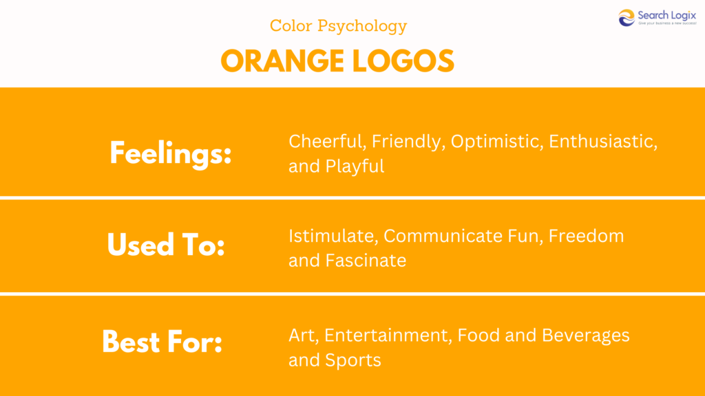
Despite these disadvantages, however, orange’s vibrancy makes orange highly used, especially for important applications like traffic signage. Pretty cool fact: 29% of people say orange is their least favorite color. That means that the target audience, as well as desired perception of the brand, should be considered when using orange.
Meanwhile, orange often enters the combination with other colors or elements for positive emotions or notions. A lot of brands like Home Depot and Nickelodeon used orange in their branding because of its friendly and confident associations.
7. Yellow
Yellow is another color that, like orange, symbolizes youth and fun. Yellow balloon, sunflowers, rubber ducks are some of the vibrant things which remind people of this bright color; it makes one optimistic and creative, extrovert and warm. Brands can utilize it for such a sense of pleasurable feelings.
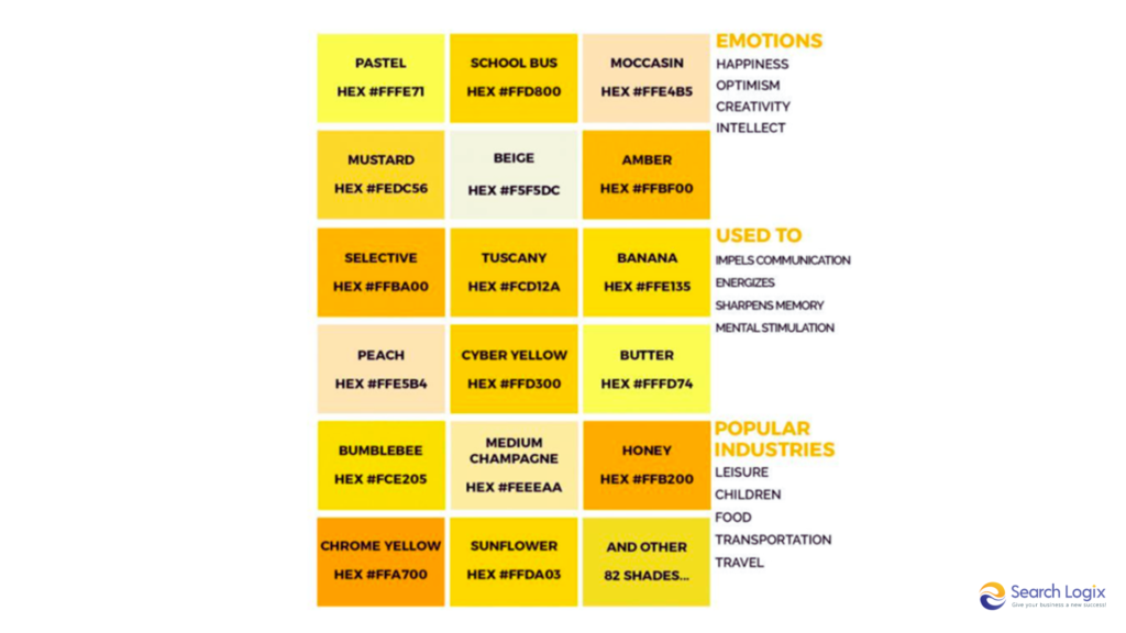
Yellow can also bring fear, irrationality, or even anxiety. Cautions signs, police tape, traffic lights, street signs give their examples of such weakness for the color. The particular shade of yellow you settle on for your graphic design will be critical to determining the overall tone of the visual graphics.
It’s also evident in the most iconic examples of successful yellow branding: the McDonald’s arches and the National Geographic rectangle, both of which are ubiquitously recognizable and a pleasure to look at.
How to Use Color Psychology in Marketing?
Learn and effectively use color to generate interesting and meaningful brand experiences. Here’s a step-by-step guide through mastering color psychology in marketing:
1. Learn and Adapt to Different Psychologies of Colors
Start with all that the world of color psychology has to offer. Delve into the basic rules governing how colors conjure up emotions and attached meanings. Expand on the general color theory so as to know more about how colors tend to work together with the human psyche.
2. Understand the Emotions
Identify what emotions you want your brand to evoke. Precisely describe the mood, personality traits, and values that you wish to be projected by your brand. Identify colors that would represent the quintessence of your brand and appeal to your target market.
3. Analyze Popular Brands for Inspirations
Look at how other brands have used color effectively in adverts. Identify some color trends and if they could be applied to your brand. Try to find examples of a brand that is successful with the use of color evoking an emotion or message through color.
4. Create A Your Own and Unique Color Palette
To assemble an effective color palette for your brand, create a palette that captures the essence of your brand’s personality and embellish your logo, website, and other marketing materials.
Experiment with lots of color combinations so that you can find a perfect balance that matches your target audience’s preferences. Even consider how your colors contrast with or harmonize with each other and appear visually in an overall regard.
5. Reflect Cultural and Business Values
Be culturally sensitive as colors have different meanings to various cultures. Avoid any unwanted message or suspicion by using a suitable color palette that could fit into diverse culture preferences. Do research on symbolism and color preference cultures to ensure appropriateness in color choice.
6. Maintain Brand’s Identity
Ensure your brand color palette is consistent across your website, social networking sites, and print media ads, thus reinforcing your brand identity and creating a memorable impression. Avoid using colors haphazardly or inconsistently – thereby watering your message to your consumers.
7. Test Different Brand Colors Among Your Audience
Conduct a survey or hold a focus group to collect opinions from your target audience about the color they feel best for you. Gather feedback to make whatever adjustments are necessary and fine-tune your color palette.
Keep in mind that perceptions about colors change with the viewer, and what really catches the eye in one audience might not be nearly as effective for another. Be prepared to take the feedback and iterate on your color choices to work for you.
All these and by using the color psychology rightly, you would be able to achieve an effective branding that looks great to the eyes and also hits the right spot with the target audience.
Push Your Marketing Efforts with eSearch Logix
We are your trusted marketing strategy partner for business growth. With our extensive team of experienced professionals, we provide a full suite of services designed to increase your brand’s visibility, engagement, and conversions.
Our team of experts will be able to help design a rich color strategy that fits into a brand’s personality, values, and target audience. We know how psychology effects color and alters consumers’ perception of it.
- Building an impressive brand identity: With this in mind, we can assist you with creating memorable brand identities by coming up with a color palette that tells the message of your brand and sparks the emotions you’d want it to create.
- Make your brand recognizable: Proper application of the same color scheme of your brand on all the marketing materials can enforce a strong brand identity that will be remembered.
- Improved brand perception: Color can influence how the consumers perceive your brand’s quality, trustworthiness, and personality
- Boosting conversions: The right color combination can provoke action, like buying, subscribing to your newsletter, etc.
Here are the digital marketing and branding services through which we can boost your brand:
- SEO: Optimize your website’s search engine rankings and drive organic traffic.
- Pay-Per-Click (PPC) Advertising: Target your target market by running targeted ads on the search engines and social media platforms.
- Content Marketing: Create high-quality, engaging content that will speak to your audience and make your brand an authority in the industry.
- Social Media Marketing: Leverage the social media platform to reach the target audience, create brand awareness, and drive traffic to the website.
- Email Marketing: Nurture leads and move to conversion through targeted email marketing.
- Website Design and Development: A beautiful and friendly website representing the brand.
Partner with us and experience the difference with our unique branding approaches that will uplift your enterprise in the market. Just share your challenges and we will transform them into conversion opportunities.


