Can you imagine what a blog design can do for your business?
While you think of the answer to this question, let me show you something amazing.
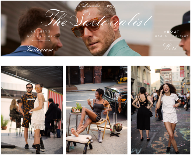
This is ‘The Sartorialist’ blog. It is a very famous blog for fashion and photography. Its blog design is so attractive that visitors who come to this blog mostly click on the CTA button “Next Page”.
Guess Why?
Because of its eye-catching blog design
Interesting isn’t it?
Now pay attention to the below
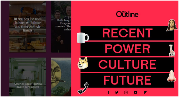
This is The Outline- a famous online magazine which has set them as a “new kind of publication” on the Internet.
Why they are saying this can you guess?
Right, its unique blog design. With flamboyant color scheme and creative blog design, they stand out completely different from others.
So let’s come back to the question, what a blog design can do for your business?
Blog is the pillar of a successful website. A good blog site drives traffic to the company, educates the audience with relevant content, and works as an influential tool to engage the target audience.
When it comes to creating a blog most bloggers fill their blog page with information-rich content for readers, which is important but if you think from a designer perspective it is half done.
In today’s competitive information-driven world, for a blog, it is difficult to stand out from the crowd and convince people to read your content.
And one of the best ways to attract readers and make a good first impression is to design a beautiful blog that inspires the audience to read your blog.
Today in this blog, I will show you 11 inspiring blog design examples that draw the attention of readers.
Let’s dive in.
Table of Contents
Toggle1. Help Scout
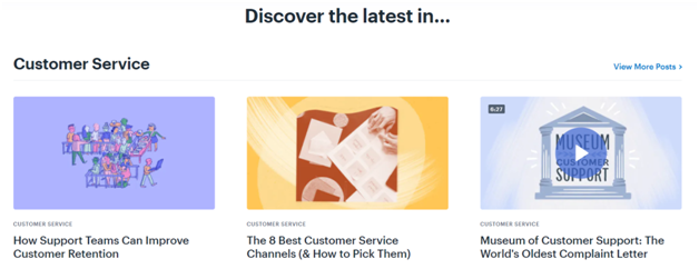
It is the blog page of a customer service software company. Help Scout is the best example of the simplest blog design which has limited use of copy and incorporated negative space on a flexible interface. The charming part of this blog is its illustrations.
It has used featured or self-designed images for every blog post. Its icons and other graphic elements are simply bright colors that easily capture the reader’s eyeball and give a sense of minimalist design to readers who are not fond of fancy web design. And this is what inspires the readers.
What Makes Help Scout Blog Design Special: Simple color scheme and creative illustrations.
Source:helpscout.com
2. The Sartorialist
The Sartorialist is a famous blog in America created by Scott Schuman. This blog is not popular for the amazing fashion and photography content that he publishes but also for the incredible blog design it has.
Its design primarily focuses on displaying the photographer’s beautiful work. The Sartorialist is a bit different by instead of having a traditional CTA button “Next page” to see more photos; it uses endless scrolling to upgrade the user’s web experience.
This blog has set a worldwide example of successful international blogging due to its wonderful design layout. It was founded in 2005 and in 2007 Time Magazine included Schuman in the world’s top 100 designer influencers.
What Makes The Sartorialist Blog Design Special: User-friendly web design and incredible images.
Just explore this blog and see whether you feel inspiring.
3. Copyblogger
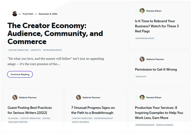
Copyblogger follows a minimalistic approach in its blog design. It uses a ton of white space and shows that you don’t need to put together a lot of elements on a single page to make it attractive or effective.
On their homepage, the bog simply shows the thumbnails of the recent posts with important tags that may hit visitor’s mind. Copyblogger is a WordPress blog which focuses on being fancy or illustrious in web design.
It is one of the amazing WordPress Blog Themes that inspire audience to read the blog by simply showing what readers want to read, with the heavily use white space to draw the attention of readers to the core topics of the blogs. At the footer of the page, it offers a CTA to inspire readers to sign up for their email marketing list.
If you see on their blog reading page, the font style is basic and presents it as a sophisticated piece of information like academic content.
And this is what makes Copyblogger’s design stand out from others.
What Makes Copyblogger Blog Design Special: Intelligent usage of white space and allowing readers to focus on the topics by eliminating distractions.
Source: copyblogger.com
4. Girlboss
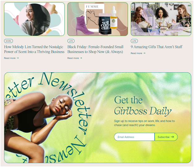
Girlboss magazine is a dedicated portal for working millennial women. Their blog has set an inspiring example of a modern blog design. Girlboss not only uses different colors they also choose stylish font style for sentences to capture the attention of readers. Their blog design is a combination of creative images and vibrant illustrations.
Every section of Grilboss blog gives a feeling of uniqueness and connection to the topics they present. Its blog theme is quite simple which lets readers scroll down the page with different categories and filters. Its eye-catching color palette and diversity in font style make Girlboss blog a hit on the Internet.
What Makes Girlboss Blog Design Special: Diverse color scheme and font style selection, and simple blog layout.
Source: girlboss.com
5. Dropbox
Dropbox is a SaaS-based cloud software company that provides data storage services. Dropbox blog has shown its creativity with innovative color scheme and layout. Its blog thumbnails are quite unique and attractive to readers. Web designers have put an artistic flair with a different graphic style and enchanting color combination.
Its eye-catching illustrations automatically draw the attention of readers and give a sense of inspiration of the message behind every article. The variation in font style and content size gives a perfect touch to the blog design.
What Makes Dropbox Blog Design Special: Its creative illustrations and vivacious color combination.
6. The Recipe Critic
If you are a food blogger, The Recipe Critic is the best inspiration for the beautiful blog design example. Its homepage is designed into important sections that target audience mostly looks for such as breakfast, dinner, salads, appetizers, cooker meals, etc.
The Recipe Critic blog design enables readers to find exactly what they are looking for. The entire blog page has been designed in a way to allow readers to easily find the right content with key information they want.
What Makes The Recipe Critic Blog Design Special: Simple design with proper blog layout customization what readers look for.
7. He Spoke Style
He Spoke Style is a popular men’s lifestyle brand, retailer, and publication that gets 1M traffic every month on its blog. This blog is one so the most famous men’s fashion blogs that still use a classic layout and this is what makes it stand out in today’s digital market.
The blog layout has a website reader showing a featured blog post and below that there is a list of recent articles. Readers here can use the navigation bar to discover the blog posts about certain topics. It has limited use of design and color combination and focuses more on using white space to give specific attention to the content of the blog.
What Makes He Spoke Style Blog Design Special: Its classic design approach and intelligent use of white space with limited color combination.
8. SPI
SPI (Smart Passive Income) is a professional blog that provides information on passive income ideas and methods. Its blog design has used the header to promote its main products such as online courses. It has incorporated a sleek and sophisticated approach in the design.
When you scroll their homepage you find their different articles in the simple design thumbnail and box. They don’t have used many colors but limited to two or three colors making it a brand color. SPI blog layout contains photos of real people and testimonials to establish social proof and inspire more signups.
What Makes SPI Blog Design Special: Limited combination of color scheme and simple layout that offer key elements on the main page.
Source: smartpassiveincome.com
9. The Crafty Needle
This blog is the perfect example of the combination of simplicity and creativity. The Crafty Needle is a well-known blog for creative sewers, embroiders, and quilters.
Its blog design is quite straightforward and uses tons of color and mind-blowing images to add more fun to the page. Readers here can find the hot topics from the top and choose them by category as well. This blog is the example of the latest ecommerce website design guide that will help you sell more.
Its white backdrop gives a good contraction to the blog’s appearance. Small thumbnails with catchy titles and brief descriptions give a quick understanding of what readers want. The most important part of the design is the use of real images that the audience can relate to their profession for the purpose the blog is based on.
What Makes The Crafty Needle Blog Design Special: Use of a white backdrop and creative color with real-life images that readers can relate with.
10. The Outline
The Outline is an online publication founded by Joshua Topolsky in 2016 in the US and latest owned by Bustle. At first appearance, there is no doubt that The Outline blog look is entirely different from other online magazines on the Internet.
As I already showed this blog in the introduction how its fancy design look has set itself as a “new kind of publication”. The Outline blog design confidently distinguishes itself through beautifully designed thumbnails and hot topics that audience wants.
The variant colors and font style in each blog post inspire readers to click on the post with a sense of hidden message. The way it has used a near-fluorescent color scheme and comedic pictures in contrast with simplest navigation approach, this blog gives a feel of visual feast to the readers.
The Outline blog has completely gone far way in terms of layout, UX design, and theme that are hardly seen on any other blogs.
What Makes The Outline Blog Design Special: Web designers here applied ‘anti-design’ technique- one of top web design trends that move away from the modern and minimalist interface. Its small animations and clear site structure supplement the overall design.
11. Tech.eSearchLogix
Last but not the least, our own blog tech.eSearchLogix is the right example of modern blog design with a bit classic approach. Our blog uses simple user interface and minimalistic layout that removes all the distractions so that readers enjoy reading.
Unlike other blogs, Tech.eSearchLogix blog doesn’t use free stock images which are available on Google; instead, we use a self-designed featured image that gives the core message of the article. The blog uses white space enthusiastically with fewer images to allow readers to focus more on the information than heavy design appearance.
Its eye-soothing color combination and minimalistic layout made this blog stand out from our competitors. Just scroll down and click on the tags to find articles that you like with different categories.
What Makes Tech.eSearchLogix Blog Design Special: Minimalistic layout with simpler color combination, and extra use of white space to allow readers enjoy reading.
So what elements ultimately make the blog design inspiring?
The answer is-
- Stylish fonts yet readers can easily read
- Accessible blog layout
- Blog design which is easy to be scanned
- Use High-class graphics or images
- Faster page load time
- Important CTAs
- Distinctive line between creativity and simplicity
- Boost engagement
- Unique blog layout that readers can relate with
Conclusion
Did these blog designs inspire you? I hope yes. If you like this post or want to share your thoughts on blog design share it in the below comment box. Or
If you want to start your own blog and want proper guidance eSearch Logix can help you in this. We are a reputed website development company in India.
For over a decade, our team has developed various amazing blogs, online publication portals, and websites for individuals, starters, entrepreneurs, and hobbyists and enabled them to get the right audience to their site.
Just Explore Our Web Portfolios and you will understand why we deserve your project


